Sunday, March 30, 2014

United Airlines Campaign: Flyer Friendly

This year McDonald's launched a new campaign: Flyer Friendly.

I noticed this campaign while traveling home for spring break. There were numerous ads in the Newark Liberty (EWR) airport with the phrase "____ Friendly". Among these were "kick back and relax friendly", "Flyer Friendly", and my favorite, "Faraway Friendly".

More information about their campaign can be found here: https://hub.united.com/en-us/flyerfriendly/pages/default.aspx


The reason I liked this ad the most was because it features a man taking a "selfie". I saw this one while grabbing Ben & Jerry's in the food court.

I think that this ad shows that United understands consumers and the new fad for taking pictures of oneself in unique places. This lends itself to the concept of Motivation and how a brand can increase consumer motivation. United is doing this by making the ad personally relevant by projecting how consumers would actually react to this situation: a person would capture a scenic view with a picture, but more recently taking a selfie would be the "normal" behavior.
Breakfast Battle: McDonald's vs. Taco Bell

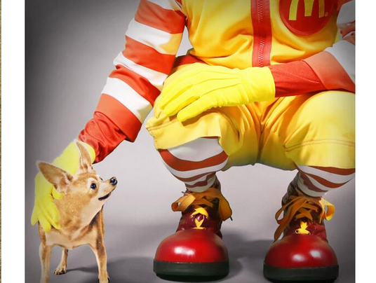
Recently, Taco Bell has attempted to break into the fast-food breakfast market. To do so, Taco Bell has to battle against fast-food breakfast giant, McDonald's. McDonald's has not stayed quiet about this new competitor and released this picture with the caption "imitation is the sincerest form of flattery".

McDonald tweet
McDonald's makes an initial attack on Taco Bell and its breakfast menu.
Taco Bell soon followed suit with an advertisement featuring 25 real men named Ronald McDonald who introduced themselves and expressed their love for Taco Bell's new breakfast options. You can watch the video below.


McDonald's followed up with a tweet "'Breaking!' Mayor McCheese confirms: 'Ronald, in fact, still prefers McDonald's.'"

This battle between two fast-food behemoths is similar to that of the rivalry between Pepsi and Coca Cola. In Strategic Management (HA 4410) we learned that the rivalry between the two beverage producers is actually not a harmful one. In fact, the friendly competition between Pepsi and Cola generates media attention and more consumers to both brands.

In summary, it seems that Taco Bell is benefiting from its competition with McDonald's. Although taking jabs at each other, the two brands are increasing exposure which contributes to the Mere Exposure effect. People will begin to develop a preference for these two brands because of their familiarity with them.

Tuesday, March 25, 2014

Positioning Away from Prototype

This 1997 Snapple commercial positions the product away from Cola, similar to the 7-Up commercial we saw in class today. The ad uses Cola as the frame of reference to show that this product is different and that it is not competing but creating a new brand category. The commercial acknowledges that the two leading soft drink brands are cola and that it is not competing for those spots. This idea is similar to the Avis "we try harder" campaign in which the rent-a-car company admits to being #2 and uses that as a way to gain customer loyalty. Although this approach was not continued for Snapple's advertisements, it shows that positioning away from the prototype is not always a fit for a brand's position, personality and culture.

https://www.youtube.com/watch?v=Jf0AcRUXPbQ

Superbowl Ad Central Route Persuasion

https://www.youtube.com/watch?v=KlSn8Isv-3M

This ad shows a high involvement, central route persuasion where the consumer will have a lot of emotional attachment to both the message and imagery of the commercial. By convincing the consumers that Chrysler is truly an American brand that's original and high quality, the ad uses a strong message to let the consumers decide whether or not the brand does embodies America. Also, one of the most obvious giveaways of central route persuasion is Bob Dylan in the commercial speaking to the consumer, trying to convince them of what he's saying.

Categorization with online shopping

One online store for a variety of home-goods, furniture, jewelry, functional or random home decor items is catering their website to a different form of marketing. They advertise their product using a different form of categorization by refraining from typical websites that sell items by major titles of the type of product and rather, they sell an experience and offer multiple lines each with various products that are used to create a cohesive space. Their website allows for creating a unified space and easily offers a range of items within one category that can be purchased to design and decorate your personal space with a specific feel and ambiance (such as industrial modern or shabby chic); they create chains of themes, leading to purchases that might have otherwise been avoided by consumers. On regular websites (classic online retail, such as westelm.com) a consumer is more likely to limit their search and they have a direct reason or item in mind, they search less and do not necessarily look outside of the type of item they wish to purchase. At Joss and Main, by grouping an array of items under one title, from lamps to couches and beds, to vases or knic-knacs or paintings, a consumer is forced to shop through additional items, potentially increasing their purchases to outside of their original need. Also in this way of categorization they are taking a taxonomic approach where there are similar objects in the same category but they are similar in colors and creation of physical space or perception and feel of experience.


(above is a small clip of the heading for shopping categories according to the classical categorization: westelm.com)


(above is a clip of their homepage from https://www.jossandmain.com)

Monday, March 24, 2014

This razor ad reminded me strongly of our conversation about different methods of stimulate involuntary attention. This ad used the method of "surprise the consumer" by showing a novelty and unexpected image that encouraged elaboration and involvement. I wasn't looking for a razor ad when I saw it, but the ad grabbed my attention because the image looked so strange to me at first that I couldn't help but pause what I was doing and look more at it. The ad's novelty relies on a giant 3-D razor apparently having shaved the grass on a field to demonstrate the razor's ability. It depends on the rest of the grass outside of the one shaven strip to be unkempt and unshaven compared to the strip that the large razor is left on, for contrast. The ad also uses the idea of "making it bigger" to promote involuntary consumer attention in the sense that it's not normal to see such a large 3-D razor. I thought these two methods of encouraging involuntary attention were very effective for the ad, and thought it was interesting that they relied entirely on these methods rather than any writing (more traditional advertisement that they could have combined with their efforts to make the ad large and novel). On reflection, I feel as though writing on the billboard itself may have taken away from the surprise of the ad, or may have added too much of another element to the ad and created confusion. The white background seems to go with the shaven patch of grass; both say the razor will give you cleanliness and order.

Changing Roles


Honey Maid's new "This is wholesome" campaign reminded me of our class discussion on changing gender roles.  This ad features homosexual parents, single fathers, interracial families, military families, and a nontraditional "rocker" family.  While the product remains the same, the advertisement portrays the changing gender and familial roles, making a bold corporate statement that these new roles are just as wholesome.  The topic of changing roles is increasingly appearing in advertisements.  Companies such as Cheerios and Honey Maid are taking the first steps to reveal society's new reality.


On the subject of involuntary attention, this London bus stop got really creative with alien invasions and augmented reality.


Superb!

Sunday, March 23, 2014

No New Ideas

After discussing how marketers use similar materials I came across this picture comparison. I thought that it was very interesting because the advertisement on the left came out much earlier than the Avengers movie had. When I looked further into it I saw that the creator of the picture on the left was inspired by Marvel's comics. This is just another example of how the same material is simply reused during promotion. The Avengers was a very succesful box office hit even with its copied movie poster.
In my free time I was surfing the web and I came across this example of the figure ground principle in an African Children Initiative advertising campaign. I'm not very good at geography and it took me awhile to realize that there was anything in the picture besides the child staring up at the adult. This made me realize that certain uses of figure ground are dependent on the audience of the advertisement having a background knowledge of certain things to be able to see that there is a second way of looking at the picture if they shift their focus. If I'd shown this ad to someone who wasn't familiar with geography, or a third grader who had not yet studied a map of the world in school, their mind would likely not allow them to shift their focus at all and the effect of the technique would be lost. This is true for some ads where one of the two images depends on prior knowledge as opposed to ads like this:

which anyone, regardless of background or education, could perceive the double image in if they shift their focus. The figure ground principal therefore is limited in its power to draw attention and create involvement when it relies on the audience to have prior knowledge of one of the images because if your brain doesn't recognize one of the two images at all from memory or association, it's unlikely that you will be able to perceive a) that a second image is there, and b) what it is.

Friday, March 21, 2014

Starbucks Evenings

I recently came across an article about "Starbucks Evenings." In select locations, Starbucks will start to offer wine and beer and an extended food menu (including truffle macaroni and cheese and chocolate fondue)  after 4:00pm. According to their site, after 4pm customers will "experience a more mellow, less hurried atmosphere for winding down and having casual conversations." The selection will vary to meet "local test preferences." In recent years, Starbucks has expanded its offerings to include breakfast and lunch options, as well as Starbucks Ice Cream--that way, more customers would come in during lunch hours, and buy more Starbucks products in general. They have also made large deals with other big companies, including Evolution Fresh (juices), Whole Foods, La Boulange, and Teavana. Now, with the addition of gourmet food and alcohol for Starbucks Evenings, Starbucks has expanded its brand even more to draw people in at later hours--thus creating in billions of dollars in potential revenue. Starbucks' brand extension has been successful because it has been able to leverage its existing customer base and brand loyalty to create new products.  Through extension, Starbucks has successfully skewed its image to be more of a lifestyle/food and drink brand than just a simple coffee shop. Starbucks' chief operating officer noted that the addition of alcohol to Starbucks cafes won't work everywhere--based on test runs, he said they've seen success in urban areas, near other restaurants and theaters, where people are out at night. Location and the characteristics of consumers in certain areas is important to consider as Starbucks expands in this new direction.


http://www.starbucks.com/coffeehouse/starbucks-stores/starbucks-evenings

http://www.businessweek.com/articles/2014-03-20/what-to-expect-from-starbucks-new-booze-menu

Whats more Kickass than first class? Delta's New Innovation Class

Cool Delta Ad:  https://www.youtube.com/watch?v=3_-1LPRMD_4

Short and simple:  Important people fly all over the world, Delta is letting you apply through LinkedIn to buy a seat next to one of these people.  This will allow you to spend 3-5 hrs having a 1 on 1 session with leaders and innovators in the field you are interested in.  I thought this was a really cool advertisement because it is potentially a new way to segment their market and generate additional revenues (normally people just pay for their seat and the service they get, but now people will be paying for their company and who they can sit by).

Potential drawbacks:  By joining forces to "connect today's high-profile influencers with the business leaders of tomorrow at 35,000 feet" they will not only make it harder and more expensive to get seats on a plane, but the plane will be noisier as well (not everyone wants to listen to your conversation for 5 hrs, some people just want to sleep)!

Time article "Delta and LinkedIn join forces to irritate everyone":  http://time.com/30950/delta-and-linkedin-join-forces-to-irritate-everyone/

Thursday, March 20, 2014

UPS Positioning & Spreading Activation

UPS was locked-in as the number one delivery service for small packages. Their original logo was simply a small parcel with a bow tied around it; they outwardly identified themselves with small packages, confining their image to small package delivery. In order to break away from small packages, UPS needed to have a strong repositioning.

Instead of coming across with an in-your-face strategy to rebrand, UPS took an incredibly intelligent approach- they made an intermediate connection, or a new node, in order to link their new positioning to their old one. They took a random, boring color, brown, and "made it cool." They associated their product with brown in several ways. They repainted all of their trucks, changed their employee's uniforms, and even changed their slogan to "What can brown do for you?," essentially making "UPS" synonymous with "brown."

After UPS was known specifically for the color brown, a process that took several years, they were disassociated with their original positioning as only a small parcel delivery service. They could then shift their positioning through the color brown to their new goal: a shipping logistics company.

This leads us to today. UPS no longer has the slogan "What can brown do for you?"

They now have "We <3 logistics."

This just goes to show the extreme power of spreading activation and the associative networks our long-term memory maintains on how we view, understand, and coexist with even the most well-known and established brands. By finding an unrelated node (brown), UPS was able to shift an extremely deep association away from its roots to something completely different.

Article on the slogan shift from 2010:
http://www.brandchannel.com/home/post/2010/09/13/UPS-New-Global-Campaign.aspx

E-commerce and gender differences

In class, we talked a lot about gender differences when a couple shops together. I recently found an article that discussed how men and women shop not in actual stores, but online. I decided to write it here since we didn't really touch on eCommerce.

1) Sometimes, consumers tend to look at the items in store first and then purchase them online for a cheaper price. While the majority of people don't do it, 12% of male customers said they looked at an item in the shop and bought it afterwards on the internet for a cheaper price; only 9% of women did so. This is an interesting finding: it seems to me that the endowment effect has a lot stronger impact on women than men. I can personally agree with this: when I find something that fits me or that I like, I would prefer to buy it on the spot rather than wait days before I can actually wear it.

2) Women are more likely to pay attention to marketing emails; "14% of women, compared to 8% of men, say that they first saw their most recent online purchase in an email from a store." With this in mind, companies can look over their email subscriber database and send out more promotional emails to women. Also they could try sending them out at times when the consumer is more likely to look and respond to those messages.

3) "Women are also more likely to use coupons, with 34% of women using them vs. 26% of men." One marketing strategy would be to include and advertise the discounts and coupons more prominently in the emails. 

http://smallbiztrends.com/2013/08/male-vs-female-shopping-behavior-survey.html

Sunday, March 9, 2014

Can A Goldfish Show You How To Excite Your Customers?


Can A Goldfish Show You How To Excite Your Customers?

In the competitive hospitality market today, hotels are forced to take the next step to market themselves to consumers. The Soho Grand, in New York City, offers guests a simple, yet memorable, gold fish during their stay. The "gold fish touch"generates prosperous word of mouth status from the delighted guests staying at the prized hotel. The word of mouth rave reviews greatly increase customer satisfaction and future sales (ding, ding, ding...jackpot).

 Studies show that word of mouth advice generates 20 - 50 % of all purchasing decisions and a 10% word of mouth increase boosts sales by 1.5%. In the linked article below, there are ways in which companies can differentiate themselves to boost word of mouth sales and sales in general! The bullets pertain to technological apps, hotels, and anything and everything that could attract a consumer.


1. Simplicity
2. Quality
3. Exceptional Service
4. Innovative Technology
5. Hedonism
6. Exclusivity
7. Mystique


http://www.forbes.com/sites/mckinsey/2014/02/14/can-a-goldfish-show-you-how-to-excite-your-customers/

One More Dove


Here is one more example of the Dove campaign and a parody from the short ad.  Is this really how male and female's view themselves?  Are there takeaways from these clips to help understand each type of consumer?  Again, what effect does the parody have on the propensity for consumers to buy Dove products?


Dove: The Evolution of Beauty

During our class discussion, we saw the Dove commercial for "Real Beauty".  Here is one of their campaign ads.  However, look what happens when there are spoofs of the advertising.  How does that impact the brand, customer preference and the general campaign?


Drive like everybody is an idiot trying to kill you

http://www.youtube.com/watch?v=bvLaTupw-hk


In order to get people to drive slower, this creative New Zealand advertisement focused on social norms rather than trying to highlight the monetary punishment that comes with speeding.

Studies have shown that a speed reader which reminds drivers how fast they are going with either a frown or a smiley face is much more effective than expensive cameras which capture license plates and then send tickets in the mail.  This is because when try to motivate and reinforce people with monetary measures, market norms take over, and people perform a cost benefit analysis.

For example, in order to try curb carbon emissions, China introduced carbon credits which charged companies money based on how much they polluted (if they polluted less they could sell their credits, and if they polluted more they needed to buy more).  The result of introducing money to this problem was that after a cost benefit analysis many companies found it was cheaper to pollute more and buy credits instead of becoming more sustainable.

When we look at speeding tickets, money is often the most expensive and least effective way to motivate people.  New Zealand does a great job in this advertisement, by staying about from money and reminding the consumer that when they speed it doesn't just affect them, but it also effects everyone around them.  They also did a really good job with how they framed the ad because instead of saying it was the fault of the person speeding (could cause people to become defensive, "self serving bias"), they phrased it as everyone makes mistakes.  By staying away form market norms and focusing on social pressure this advertisement was much more effective at sending their message to slow down.

How you feel after watching the ad --> http://i.imgur.com/Ltwew26.gif


Friday, March 7, 2014


During our class conversation about gender stereotypes on Tuesday, I recalled a commercial I recently saw.  The commercial (displayed below) depicts a Dad being reminded constantly via sticky notes by his wife and son to put Go-Gurt in his son’s lunch box.

This commercial pulls upon Snoop, as it shows both the wife as well as the little boy placing reminders for the Dad in all of the places he comes in contact with during his daily routine, such as the lunch box, cabinet, and freezer—the wife and child know the Dad’s patterns and place the notes accordingly in order to make sure he would not forget the Go-Gurt. 

This commercial is targeted more towards Dads then it is children, as it shows how much kids love Go-Gurt as well as that it is a healthy and nutritional snack.  I found it interesting that the Dad is portrayed in this commercial as the parent who puts together the child’s lunchbox, versus the Mom.  With the steady raise in dual-income families, both parents not only work but also take care of the kids.  This commercial is a good example of how times are changing and the stereotypical stay-at-home Mom is starting to phase out.   

Thursday, March 6, 2014

Following up from the Dove commercial we saw in class, I remembered when this image was circulating the web:


There is a huge contrast and I think it creates a positive image for the Dove campaign compared to the Victoria Secret campaign. Dove's campaign is more relatable to the average woman whereas the Victoria Secret campaign depicts the "ideal" female figure. Although VS encourages women to "love their bodies," the focus of the ad does not reflect an average woman. On the other hand, Dove encourages women to accept themselves despite their differences.

Wednesday, March 5, 2014

Oscars Selfie and Samsung's Product Placement


Samsung did a great job during the Oscars of breaking through the confines of the commercial break. As we discussed earlier in class, only 19% of consumers actually watch commercials during TV breaks. Knowing this, Samsung combined product placement with numerous commercials, spending nearly $20 million during the Oscars to help viewers better remember their products.

In particular, the Oscar selfie that went viral was a huge plug for Samsung. Host Ellen DeGeneres used a Samsung Galaxy phone during the show to take a selfie with several A-list stars, which was later re-tweeted over 3 million times on Twitter. While the stunt appeared spontaneous, it wasn't entirely unplanned, as Samsung negotiated to have the Galaxy integrated into the show. It hasn't been confirmed whether the selfie with the Galaxy was planned, but in rehearsals Ellen did mention taking a selfie during the show, and she was trained to use the Galaxy. 

This kind of viral magic can't be achieved through commercials alone, and this is why product placement is such a powerful tool. This is huge exposure for Samsung's Galaxy, which has been competing with the Apple iPhone for some time. Here is an article about the selfie below:

Tuesday, March 4, 2014

Microsoft's "Sexist" New Ad

http://thinkprogress.org/media/2014/03/04/3357881/microsoft-releases-sexist-commercial/#

Above is the link to an article berating Microsoft's new TV ad and the actual ad. It portrays a woman planning her wedding using the Microsoft Tablet. The article describes the ad as a "patronizing approach to female consumers" and that Microsoft is trying to target women because they are increasingly using technology, even though men still dominate the industry. Although, yes, the woman in the ad mentions her wedding, Pinterest, and bridesmaids (very cliche women stereotypes), isn't it still possible that a woman could use this tablet to do such tasks? The article later states, "Its latest effort aside, Microsoft has run a non-stereotypical ad that features a female paramedic, student and XBox gamer — a more inclusive, less cliche take on how women use technology." So if other non-stereotypical ads are also being run, what's so bad about an ad revolving around a woman planning her wedding? 

Vintage Sexist Ads

I was perusing BuzzFeed this morning and come across a link to some pretty outrageous vintage sexist advertisements: http://www.buzzfeed.com/briangalindo/17-ridiculously-sexist-vintage-ads . Based on our discussion in class today, I was really interested in seeing how gender-based advertisements have evolved over the decades. Some of these ads are extremely sexist and clearly depict women as inferior to men. The Van Heusen ads (#14 and #15) show a woman bowing down to as well as being spanked by a man, underlying the theme that Van Heusen clothes are the best to show authority in a "man's world." Putting on a Van Heusen shirt will somehow endow a man with a sense of newfound power and boldness. Given that Van Heusen is a still a well-known mens brand, I'd be interested in learning more about how they brand has evolved its messaging over the years. Another advertisement that I found particularly amusing was #11. Post Grape Nuts. The ad focuses on how Post Grape Nuts can help a woman maintain her figure. If the teenage girl strays from this diet saving trick, she will be outshines by her mother. This advertisement really stuck out to me because instead of debasing women at the expense of men, it pits women against each other. In this manner, a woman is forced to think about how she stacks up against other women as well as how men will perceive her if she foregoes her Post Grape Nuts.

Monday, March 3, 2014

Oscars Trailer

http://www.youtube.com/watch?v=DisioPE86AY


This is the advertising campaign/trailer for the 2014 Oscars that occurred last night, and in my opinion I believe this was an extremely effective campaign.  Ellen is a very well liked and influential figure, and I know in my house every one had to be absolutely silent anytime the trailer came on.  Like we learned about in SNOOP, this trailer demonstrated personality, and more specifically extroversion and openness.  Ellen appeared to be having an outstanding time while creating this video, and this definitely came off in the production of this video.  While sometimes the Oscars tend to be boring to many individuals, this promo put the Oscars in a different light, especially with Ellen as the star of the show.

McDonald's Mighty Wings Dummy Variable

McDonalds initially tried selling their new Mighty Wings (KFC quality) at Buffalo Wild Wing prices $1+ a wing.  This did not reflect a good value for the McDonald's consumer because for $1 they could also get anything on the dollar menu instead of a single chicken wing. 

The result: they got stuck with over 10M lbs of unsold chicken wings, so they started this new promotion that utilized a Dummy Variable (the chicken wings are perishable so they need to get rid of their stock before it goes bad).

Dummy Variable:  Comparing the 3 wings for $2.99 and 5 wings for $3, the 5 wings are clearly superior. With just the 3 and 5 wing sets, 99% of people would get the 5 wing set and be very happy with their decision, they paid an extra penny and got 2 more wings, that creates good value for the consumer.

However, if you are smart like the rest of us at Cornell, you might have also noticed that you can buy 2 sets of 5 wings for $6, which is much cheaper than buying 10 wings for $8.99.  So instead of initially getting just 5 wings you are tempted to get 10 or 15 wings because the second dummy variable gives you the perception you are getting greater value than just getting the set of 5!  This pricing structure creates massive value for McDonald's consumers and also drives the sale of their Mighty Wings which they need to get rid of.


Sunday, March 2, 2014

Yahoo! Advertisement Campaign


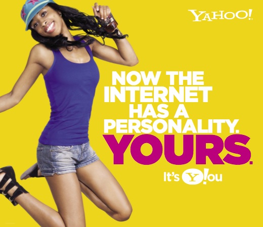
This print advertisement is from an ad campaign that Yahoo! ran, which strived to stronger connect its brand to each individual customer. The campaign allowed for users to customize their own Yahoo! page and personalize what specific news appeared on their home page. This print advertisement relates to two different concepts which we have been studying in class.

Firstly, Snoop discusses how our personalities seep through in everything that we do. This advertisement shows a woman jumping, which Dr. Sam Gosling said can be a true indicator of personliaty. From this ad, we can see the woman is kicking her legs back and smiling, which indicates she may be extroverted. Although this woman may be extroverted, many other users may have different personalities, which Yahoo! will also strive to accomodate. With Yahoo! attempting to personalize each users experience on their web site, users may be more apt to use the search engine, because it better fits their wants, behaviors, and needs.

Secondly, this advertisement also uses bright colors and bold print in order to gain the attention of their audience. It utilizes the concept of perceptual vigilance, by making the ad campaign targeted to each specific individual. In this advertisment Yahoo! clearly emphasizes the word "Yours," through the use of bright colors and larger font size.  If viewers realize Yahoo! is trying to make the message more personally relevant to them, by connecting with each person's own needs, customers will be more likely to pay attention to the advertisement.